VELA: AN APP FROM SCRATCH
From surfers to surfers.
The project
Context
Over the course of 5 months to become a certified UX Designer, I was asked to create an app that provides beautifully displayed and easy to understand forecasts for water sports enthusiasts.
Role
The project was covering the entire design process, which gave me the chance to dive deeper into UX Research, UX Design, but also UI Design.
Task
As I surf myself and know very well about the struggles of reading surf forecasts the decision was made to focus on creating a forecast app for wave surfing.
Surf forecasts, okay. What's the challenge?
Interplay of various factors
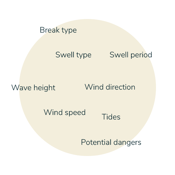
That's a lot, right? The main challenge was to present forecasts, which are an interplay of various factors, in a way that is easy to absorb and, at the same time, to provide support for reading them.
The second challenge was to present all the information that comes along with searching for a spot in a way that does not end in cognitive overload. Everything the users needs in one spot, well structured and easy to process.

So, what do we do?
Problem
Surf forecasts consist of a lot of data and therefore can be difficult to read and understand, especially for less experienced surfers. Which in turn can lead to a feeling of insecurity and unsatisfying surf experiences.
Solution
Creating an app that delivers easy-to-understand surf forecasts and helps you with useful extra information and points of contact, allows even beginners a whole new world of flexibility and freedom – basically your surf teacher in pocket size.
SINE
WEESURF
Overall, I found over 10 possible competitors. Even though magicseaweed.com (MSW) is one of the best known platforms to check the forecast, I focused on Sine and Weesurf, as these two apps already seem to try to offer an easier-to-understand way of reading surf forecasts and finding suitable spots.
Indeed. So to start, I first had to understand the market. What is the competition like, who are the big players, what are their strengths, how do they stand out, but also what are their weaknesses.
Competitor Review
Now that we got a better idea of the market. What does the user say?
Surveys & interviews
For a better understanding of how users plan their surf trips or surf sessions and what their general experience with surf forecasts is, including pain points, I decided to conduct a user survey and user interviews as both methods complement each other ideally and provide valuable insights.
The main focus was on recruiting participants with surfing experience at every level. But also inexperienced participants were included.
Respondents
46
3
Interviews
14
Insights
That creates lots of data. How do we make sense of it?
To analyze the data and insights of my survey and interviews in an affective way, I used affinity mapping as a method to identify possible connections and overlaps and to sort and group components accordingly.
Affinity mapping
Key findings
Support
Most beginner and even intermediate surfers need help to read forecasts. The most important unit is wave height.
1
Safety
They feel safer when they know the spot and its characteristics already. Also, other people in the water means feeling safer.
2
Suitability
Beginners want to easily see whether a spot is suitable for their level or not.
3
Timing
They not only want to know where to go, but also when to go.
4
Sharing
Sharing experiences seem to be important, for advice and to learn from each other.
5
Reliability
Forecast data doesn't seem to be really reliable, gives you an idea, but doesn't represent the actual conditions.
6
Great! Let's have a look at our personas!
I bundled all my research into two primary personas, ranging from beginner to intermediate surfers. As forecasts can be quite complex and require at least some prior knowledge, I concentrated on this level of surfing.
Larissa and Julian
What features and content do we need to address?
By building the sitemap and user flows, I created an initial structure of the app, taking into account what kind of content is valuable to the persona per flow.
Sitemap & User Flows
Before I went for XD I sketched out all the potential screens I could think of.
First sketches

In the next step I went with my mi-fi prototype for a usability test to collect in-person feedback on what I had produced so far. In order to be able to improve it and get rid of potential frictions before I go all in and create my fully designed version.
Can you test it? Yes, you can!
Usability
Tests
Tests
6
Hours
Recording
Recording
5
Valuable
Observations
Observations
30
Key findings
Ratings
Users don't understand the wave and spot rating in combination.
1
Wave alarms
Wave alarm settings are rather suitable for experienced surfers. Suggestions aren't explained.
2
Filters
Filters to narrow your search have been overlooked.
3
Favorites
Editing the list of favorites requires a lot of clicks.
4
Overall, all 5 tasks were completed successfully by the participants.
Participants rated the difficulty of all tasks as "easy" (6) and "very easy" (7) on a scale from 1 to 7.
Overall, the prototype reached a satisfaction score of 4.2 on a scale from 1 to 5.
Success rate
Single ease
CSAT
Test performance
CSAT: Customer Satisfaction Rate
After taking my findings into account and adjusting my mid-fi prototype, I moved forward and started to work on the UI. Below I put together a few examples. Scroll further down for a clickable prototype, in case you're curious to see the entire app.
From sketches to hi-fi: Let's add some color to it
Search Results: List
Search Results: Map
Forecast Overview
Detailed Forecast
Spot Profile
Wave Alarm
After a lot of work, pixel pushing and final constructive peer feedback I finished the design of my app.
Final design
Curious? For the fully clickable prototype click here.


