LADENZEILE: EXPLORING SOLUTIONS
User-led comparison
The project
When comparing products online, users have different approaches depending on where they are in the process of their search. Some open products in different tabs, some collect them in their shopping cart, some decide right on the spot, some come back to their decision at a later time — How could we bring this experience to our platform? How could we ease the process for the user?
This project covered two phases of moderated testings with users, surveys and AB testings of the MVP onsite in close collaboration with Product Designers, Frontend and BI.
This project covered two phases of moderated testings with users, surveys and AB testings of the MVP onsite in close collaboration with Product Designers, Frontend and BI.
Company
Ladenzeile
Online shopping platform aggregating products from thousands of shops to help you compare and find the right choice for you.
Online shopping platform aggregating products from thousands of shops to help you compare and find the right choice for you.
Role
UX Designer & Researcher
Responsible for prototyping, ux writing, design iterations and testing, project management, stakeholder communication, and outcome presentation.
Responsible for prototyping, ux writing, design iterations and testing, project management, stakeholder communication, and outcome presentation.
SCOPE
Exploring solutions
Two phases of testing, MVP development and iteration, lasting about 2-3 months each. Focus for this project was fashion as one of the main categories.
Two phases of testing, MVP development and iteration, lasting about 2-3 months each. Focus for this project was fashion as one of the main categories.
The user
In general, we considered two user intents: broad and specific search.
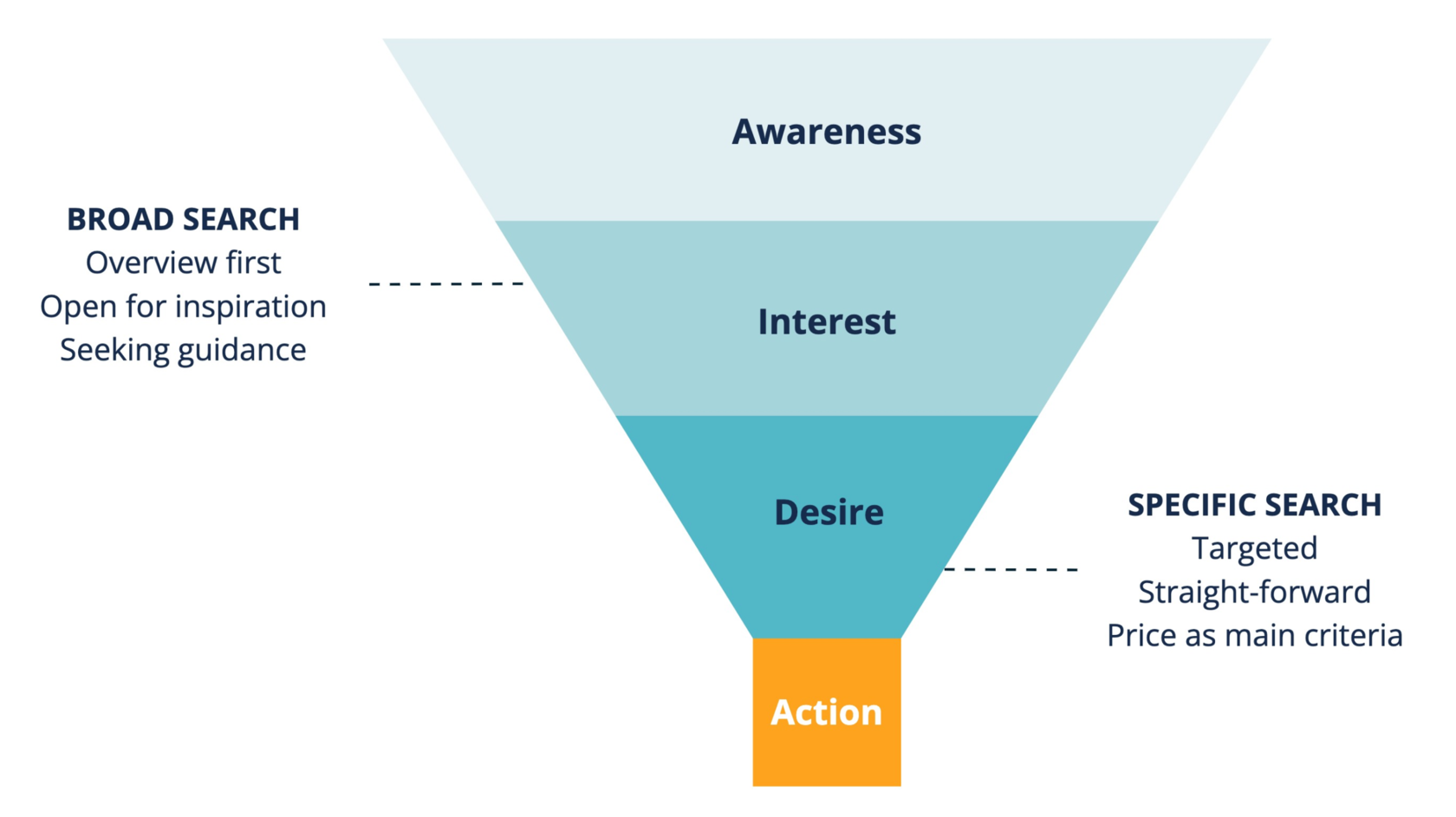
Looking at them, you can see they are at different stages of the purchase funnel and therefore their behaviors and needs vary.
In the following, we focus on users with broad search intent to support their decision making and bring them closer to purchase.
In the following, we focus on users with broad search intent to support their decision making and bring them closer to purchase.
Phase #1
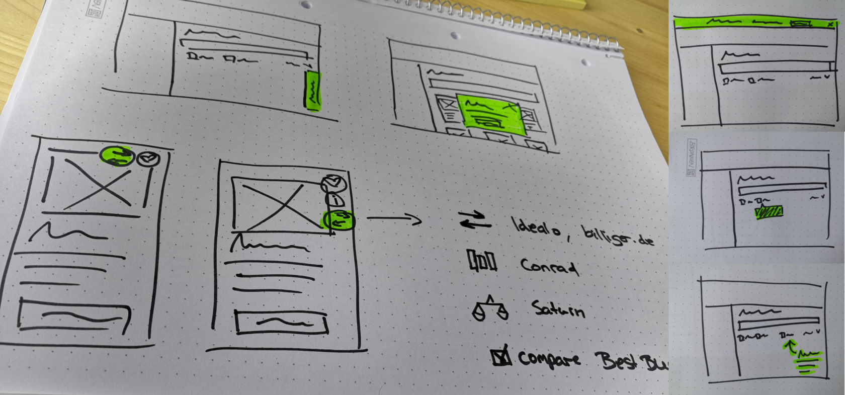
When I took over the project, we sketched out some ideas to start off, which were the basis for me to create a first low-fi prototype for further discussions. Before stepping into the task I took some time to review competitors and online shops that offered a comparison functionality.
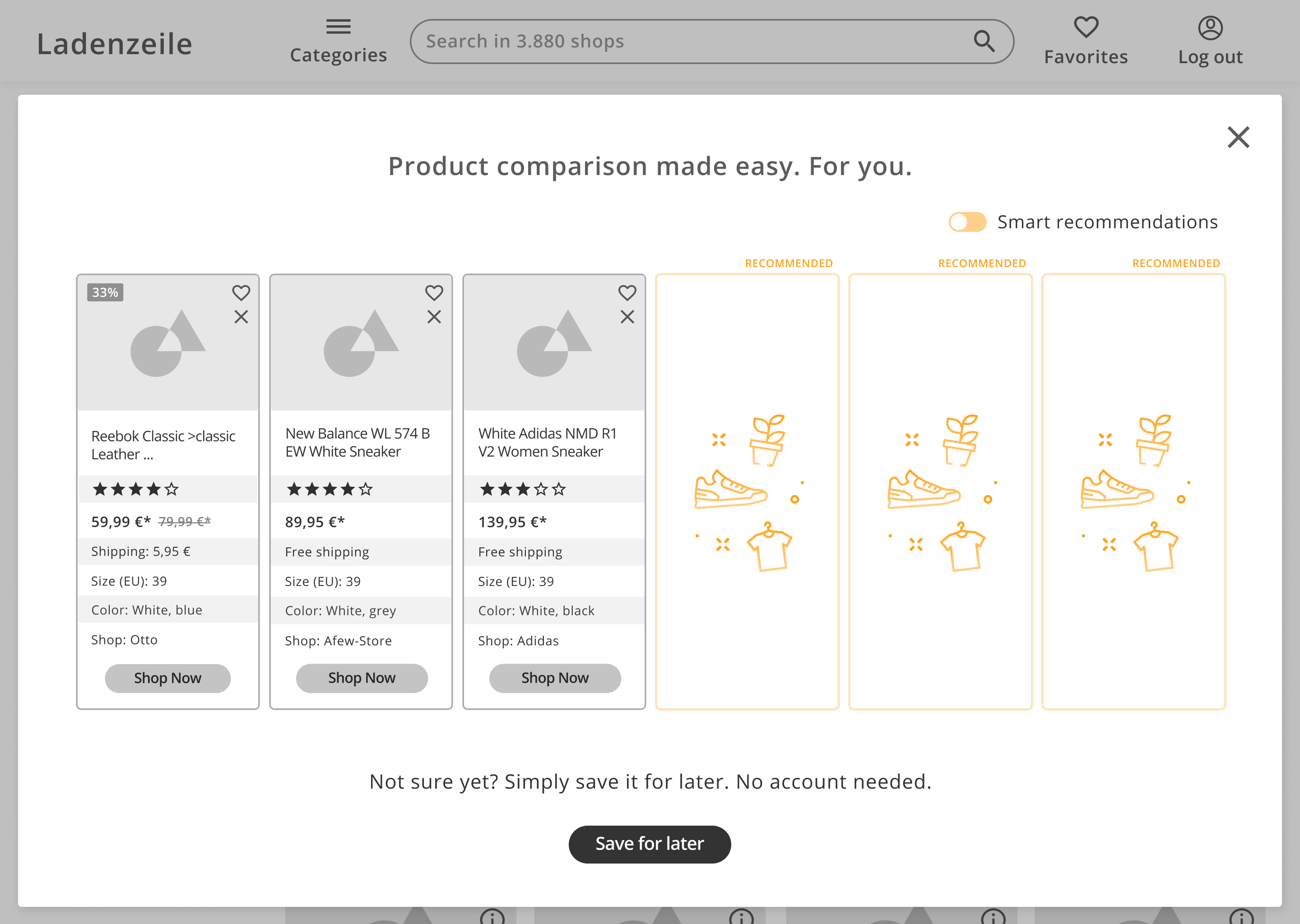
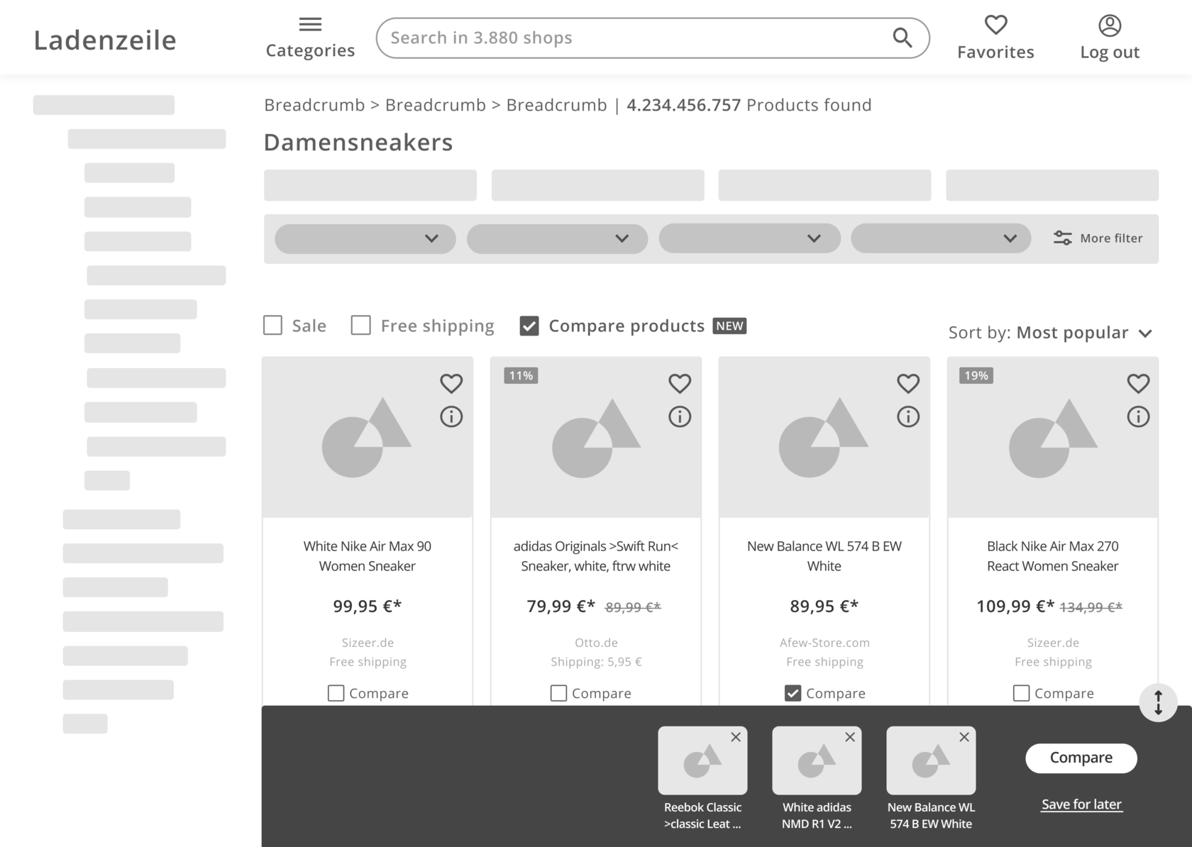
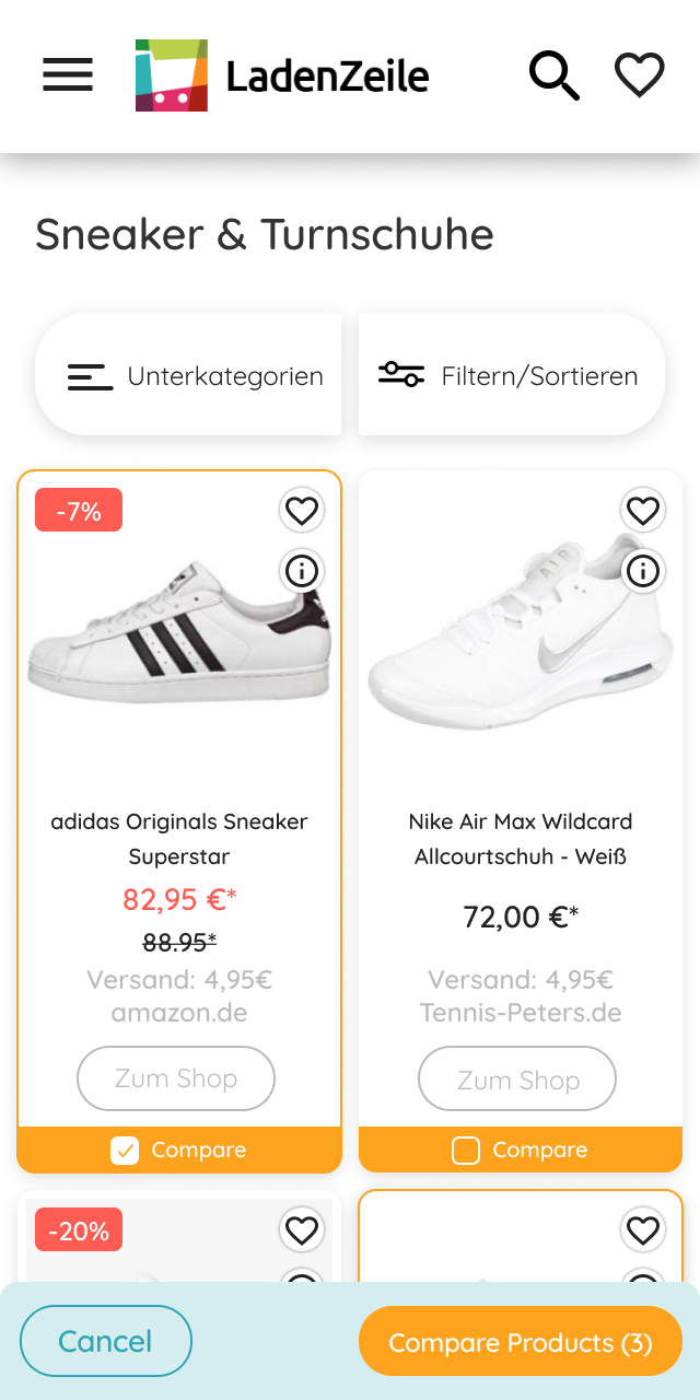
- Activating/deactivating the feature
- Selecting/deselecting products on card
- Expandable bottom bar to preview selection
- Comparison view as overlay
- Option to save the selection for a later time
- Smart recommendations on demand
First prototype
- Users don't see the checkbox to activate the feature, "Maybe because I didn't have it in mind that I could compare products like shoes"
- They expected to interact with a product directly on card
- They liked the bottom bar and found it helpful
- All users understood how to select products and proceed, "Easy peasy"
- Overall, the overview of items to compare was well to process
- Missing product attributes were material and functionality
- 6 products seem to be the maximum, more would overwhelm the user
In the next step the prototype was turned into a first hi-fi version, which I used to collect feedback from potential users. Alongside of overall great reactions on the idea, we gathered the following key learnings:
Evaluate the idea
Let's iterate
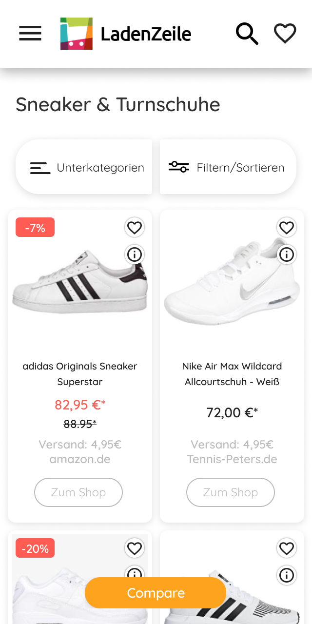
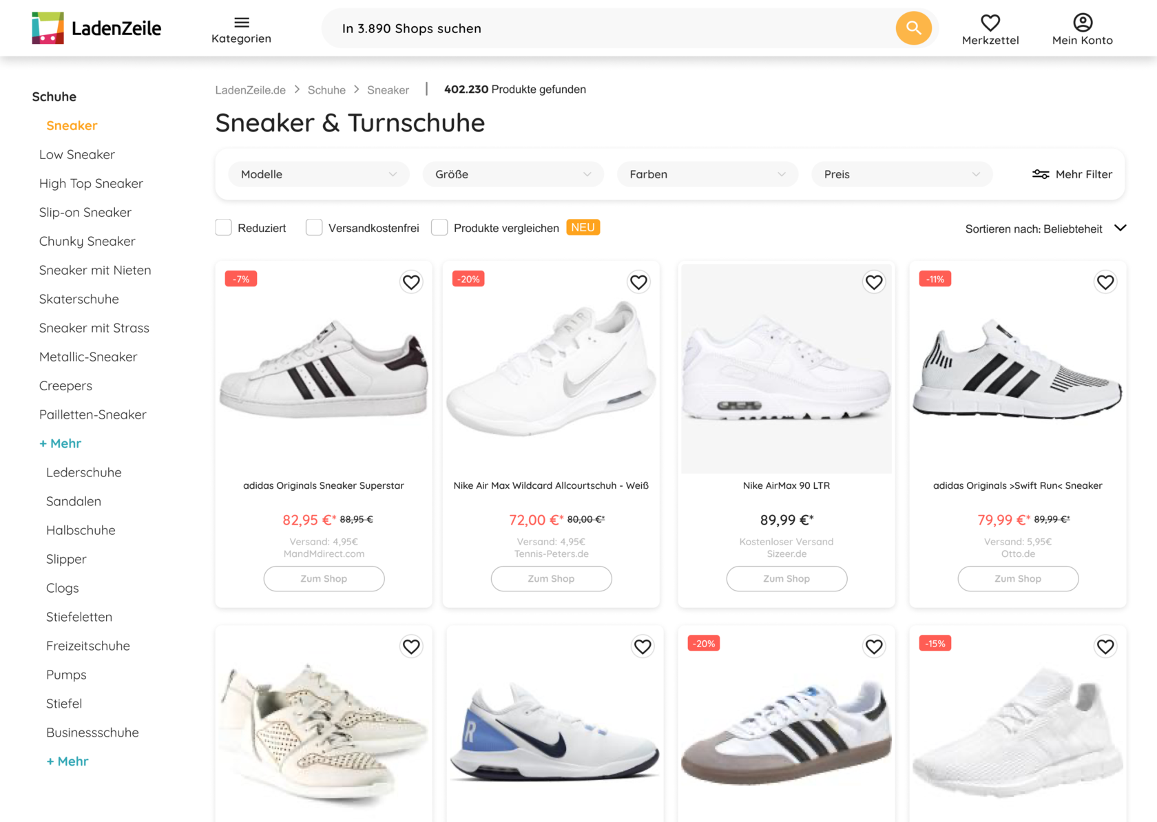
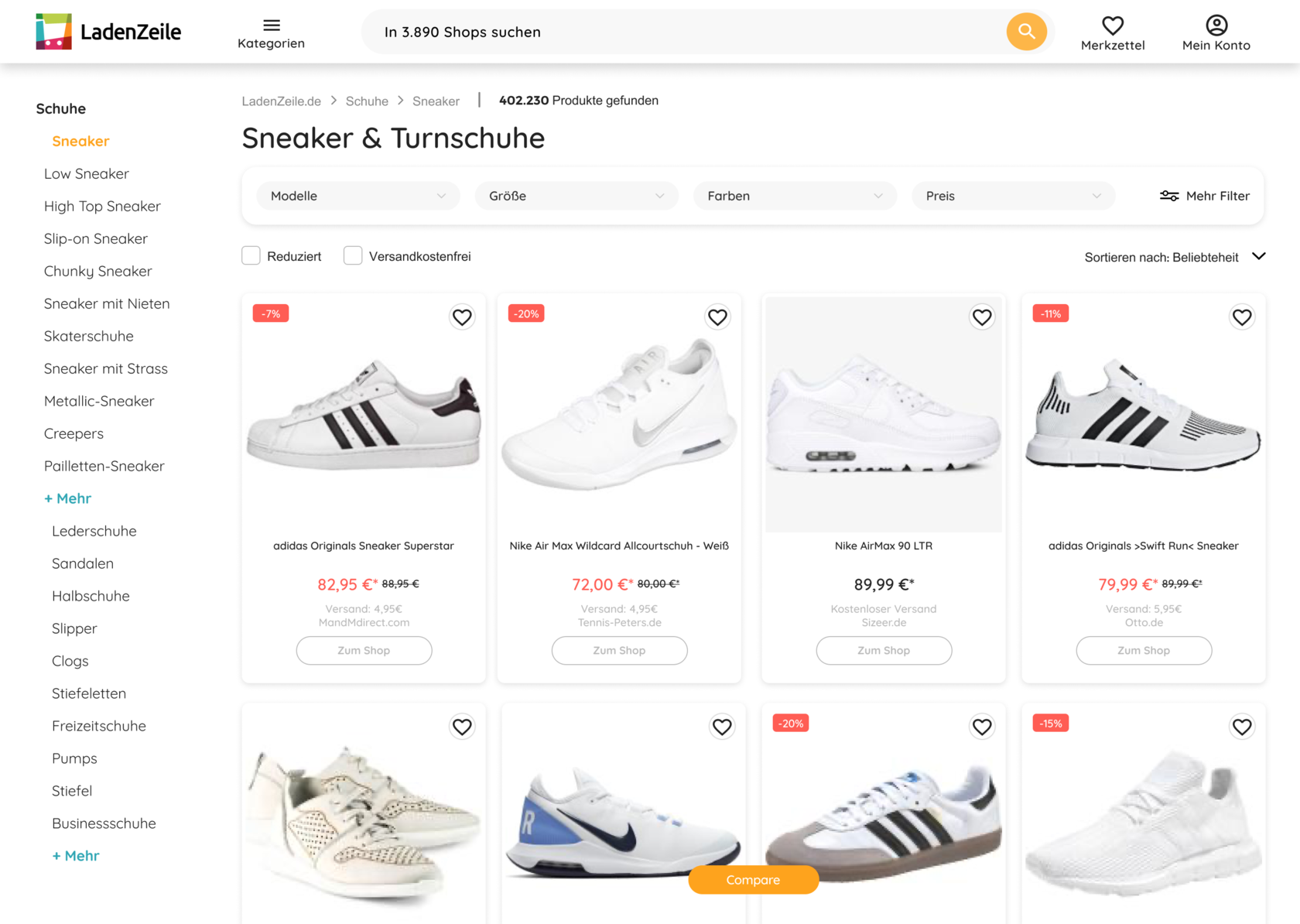
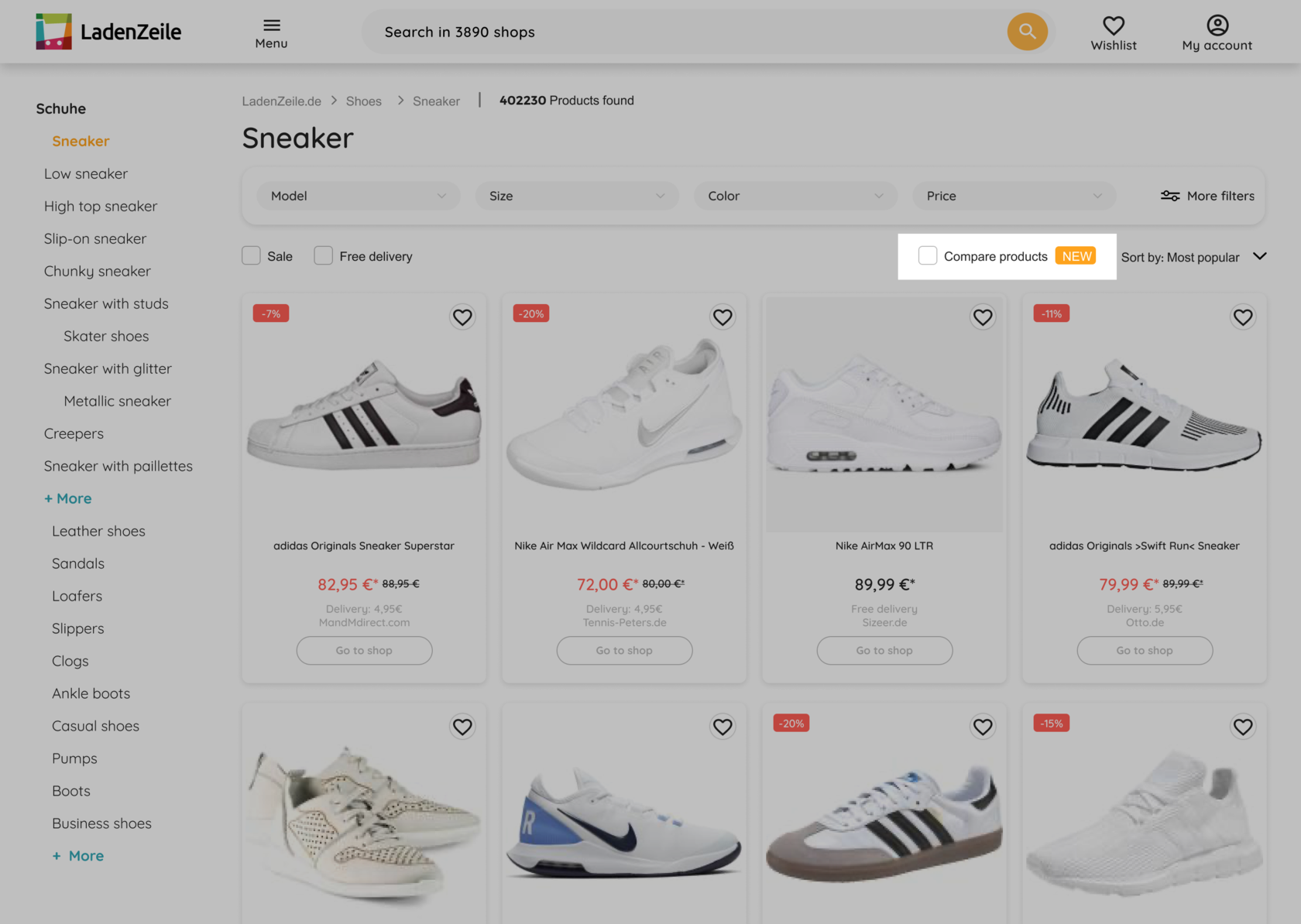
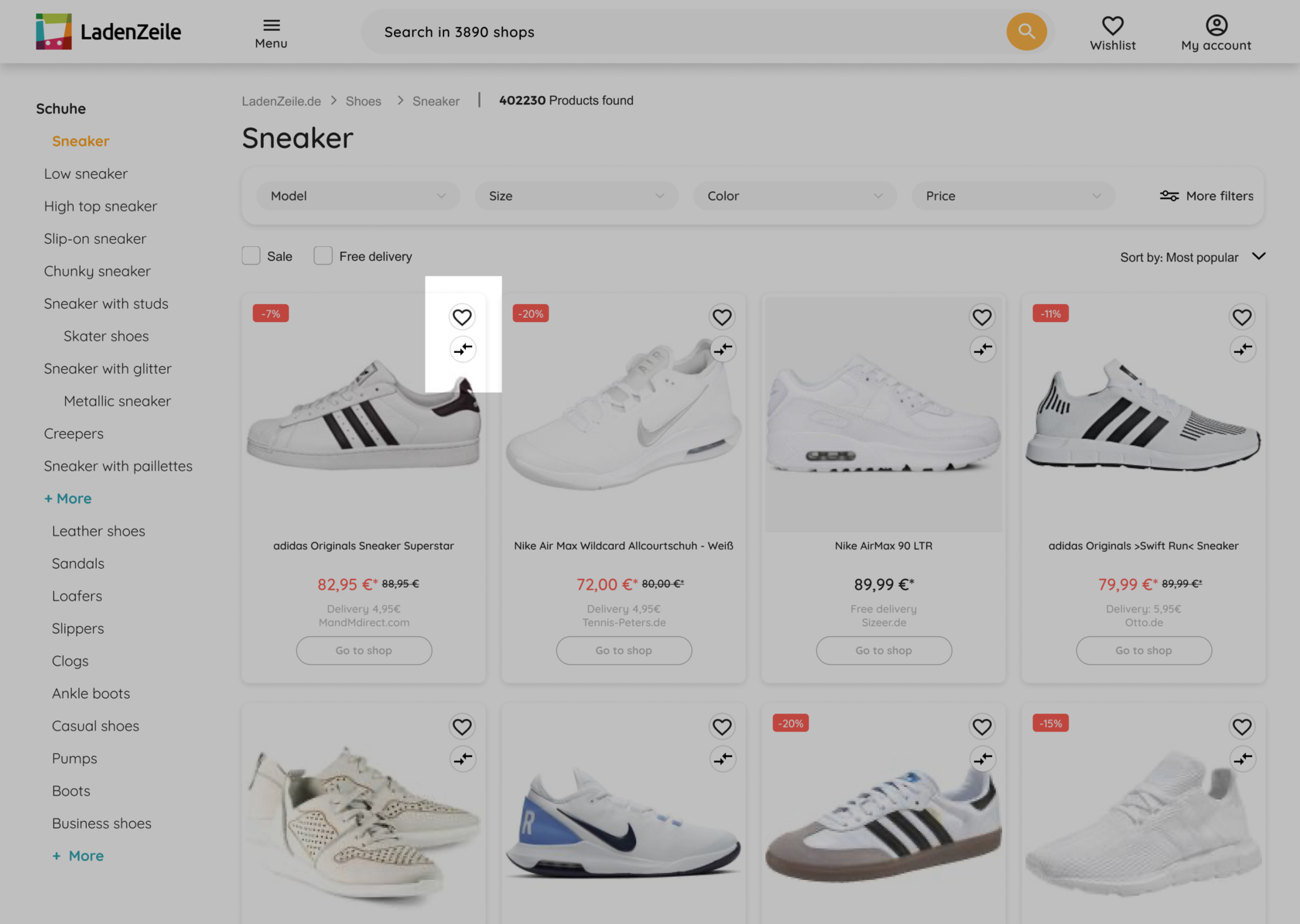
One of the first iterations was to increase the visibility of the entry point.
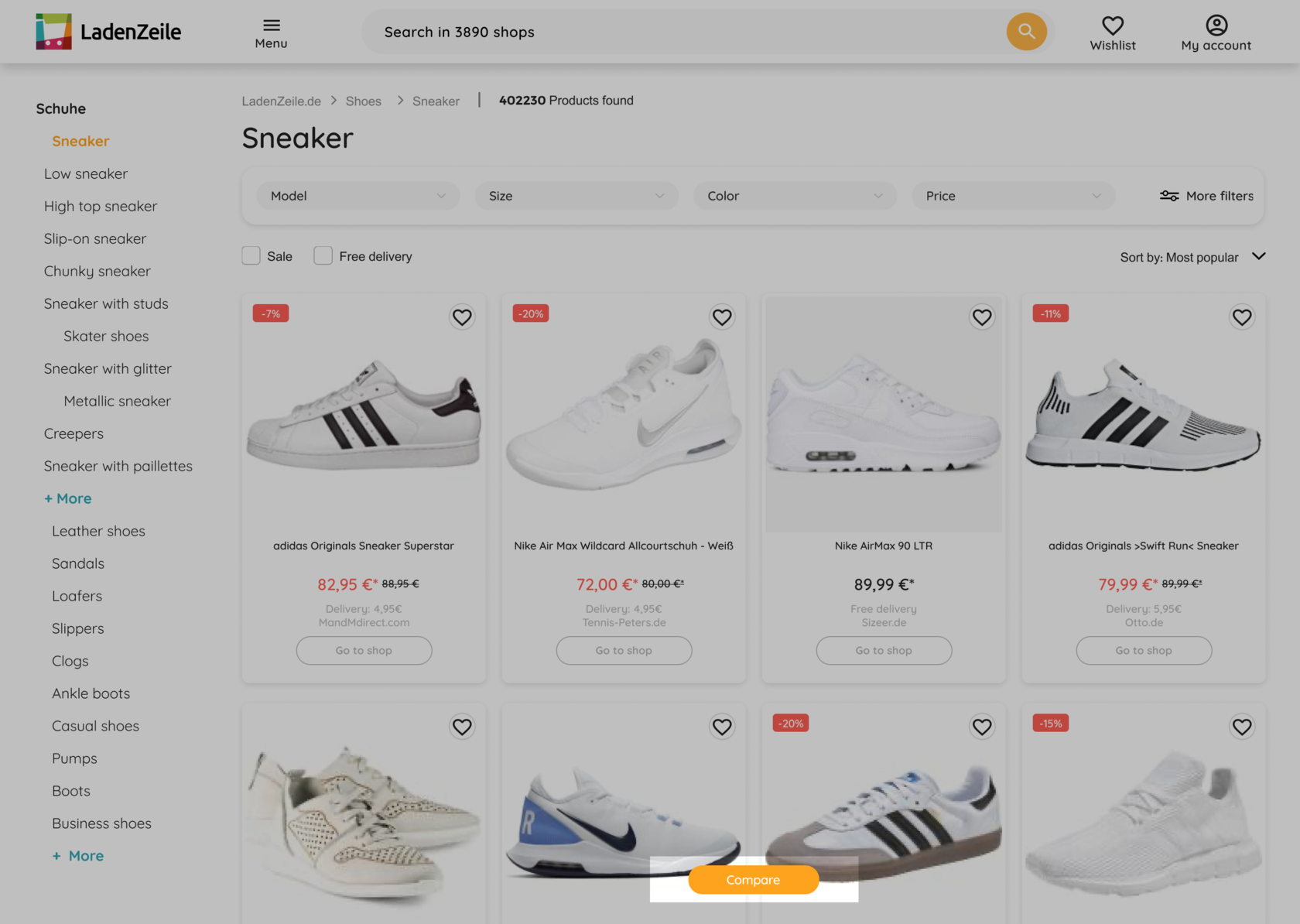
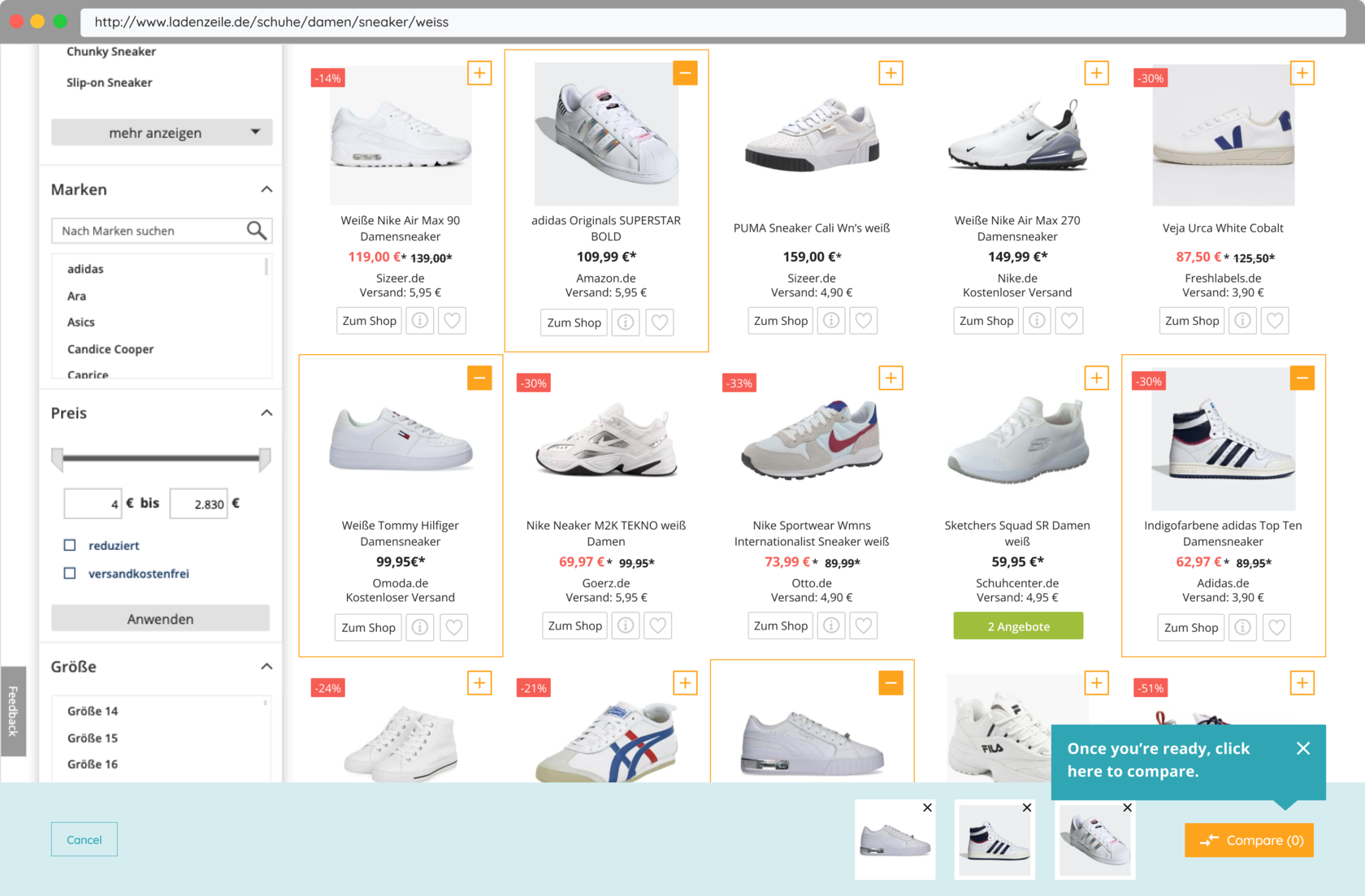
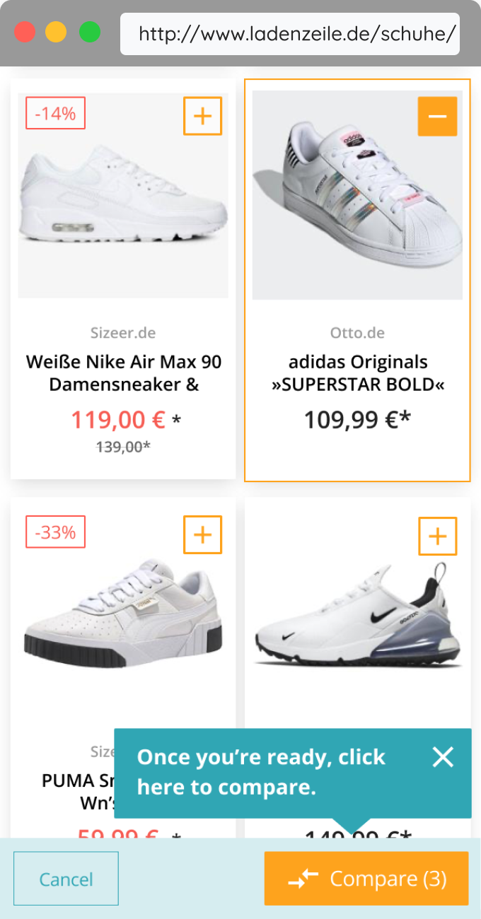
Instead of having a checkbox above grid, which seemed unexpected and was overseen, we placed a floating button at the bottom of the screen. Making sure it doesn't cover too much valuable content on mobile.
Also, we added an item count to the compare button and the possibility to end the comparison right at the bottom bar.
After aligning with the engineers, we reduced the scope of the feature to focus on its core functionality — selecting and comparing products.
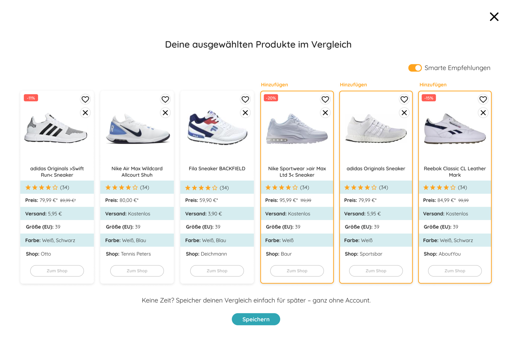
Instead of recommendations, we went for a card at the end of their selection which lead the user back to exploring.
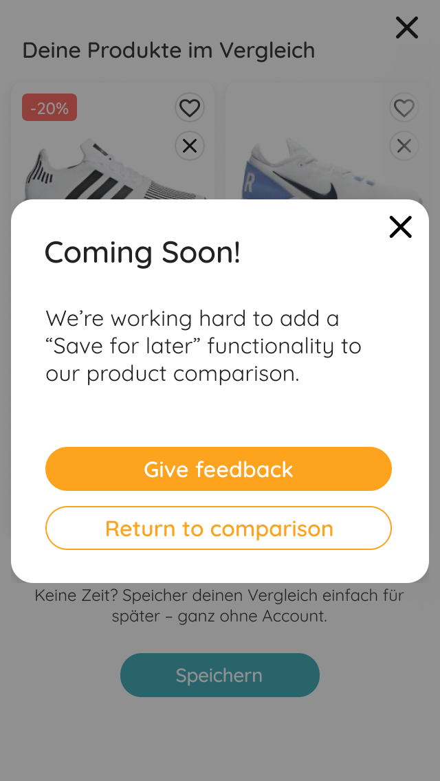
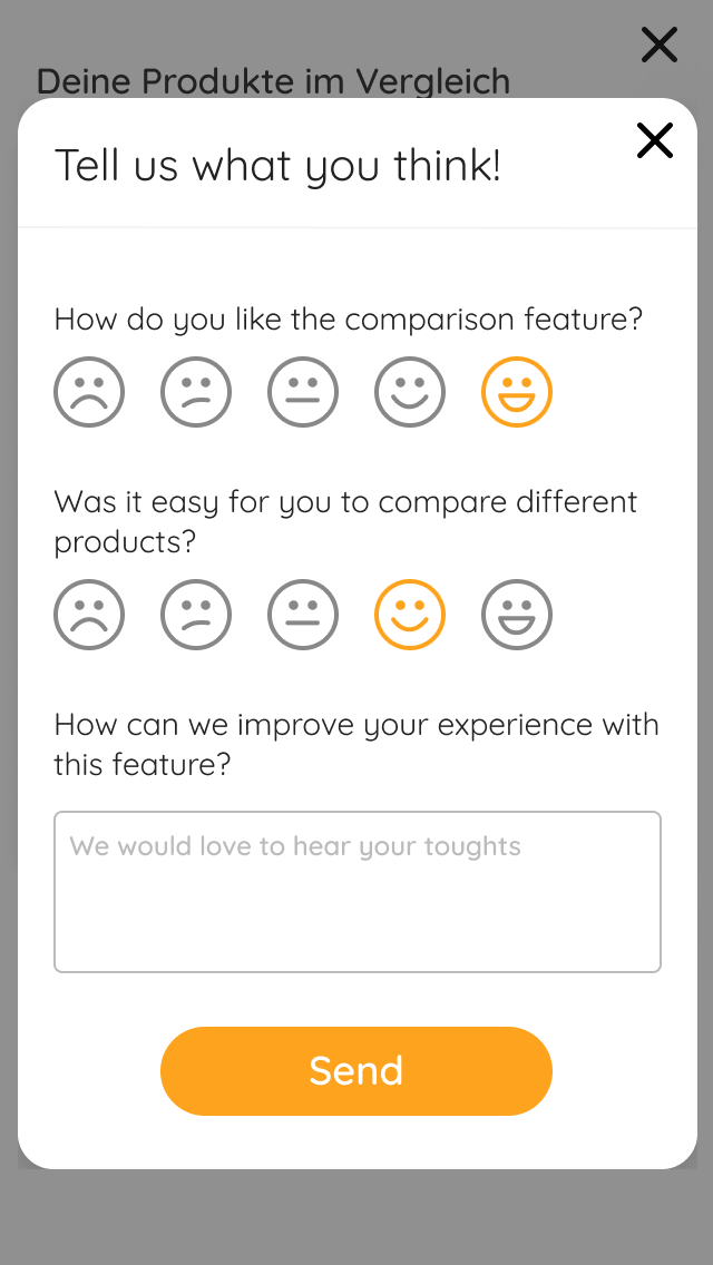
As a result of these discussions we also decided to not build the functionality to save a selection for later, but still track how many users clicked the button followed by a micro survey on the feature itself.
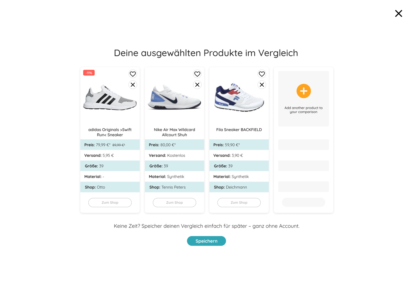
- Wide product range and categories — from fashion over furniture to garden, household goods, hardware and pet supplies, which brings different levels of relevance for further product comparison
- Information needed to compare depends heavily on the type of product, e.g. tshirt vs. wardrobe
- Inconsistent data for displaying product attributes due to a great variety of formats coming from partner shops
When it comes to (technical) limitations, we had to consider the following aspects, or at least keep them in mind when proceeding:
What else to consider
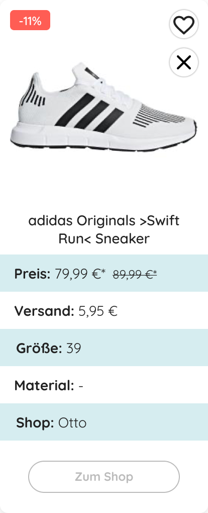
Going further, we decided on the following main attributes for the first round of testing: image, title, price, discount, delivery cost, size, and shop. Based on user feedback we exchanged color with material.
In addition, we left out product reviews, as the database was too small and would leave it blank for most products.
In addition, we left out product reviews, as the database was too small and would leave it blank for most products.
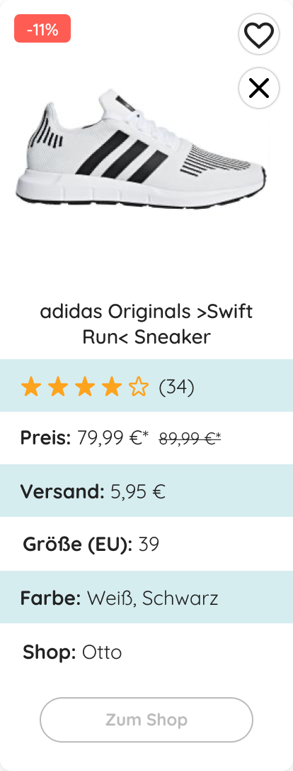
"I think the comparison is really awesome!"
"Normally I would look through the shops one by one — this way I could have everything done in one go!"
"Normally I would look through the shops one by one — this way I could have everything done in one go!"
As the overall feedback we got from the user tests was very positive and we considered the concept as proved, we were excited for the upcoming AB test results. How would users interact with our feature "in the real world"? Must bring us great results as the feedback was so good!
Well… no. To our surprise the results of the user and AB test couldn't be more contrary. Positive feedback from users on one hand, very low engagement with the feature on the other.
Clashing data
How might we address that?
- No significant visual change on smaller screens after activating the comparison
- Prototype for user testing was "too well" curated and didn't reflect reality
Further aspects that potentially influenced the tests:
So, the big question is: why?
Maybe a product comparison feature is still too new for users, maybe they don't understand how to use it, it's not a learned behavior yet. That must be it!
Maybe a product comparison feature is still too new for users, maybe they don't understand how to use it, it's not a learned behavior yet. That must be it!
Phase #2
In the next steps I worked on a few solutions to promote the comparison feature and by that provide a clearer entry point for the user.
A
B (winner)
C
Test entry points
After discussing my ideas with the team, I prepared an unmoderated user test to generate fast feedback.
Version A: Checkbox above grid
Version B: Floating button (winner)
Version C: Icon/button on card
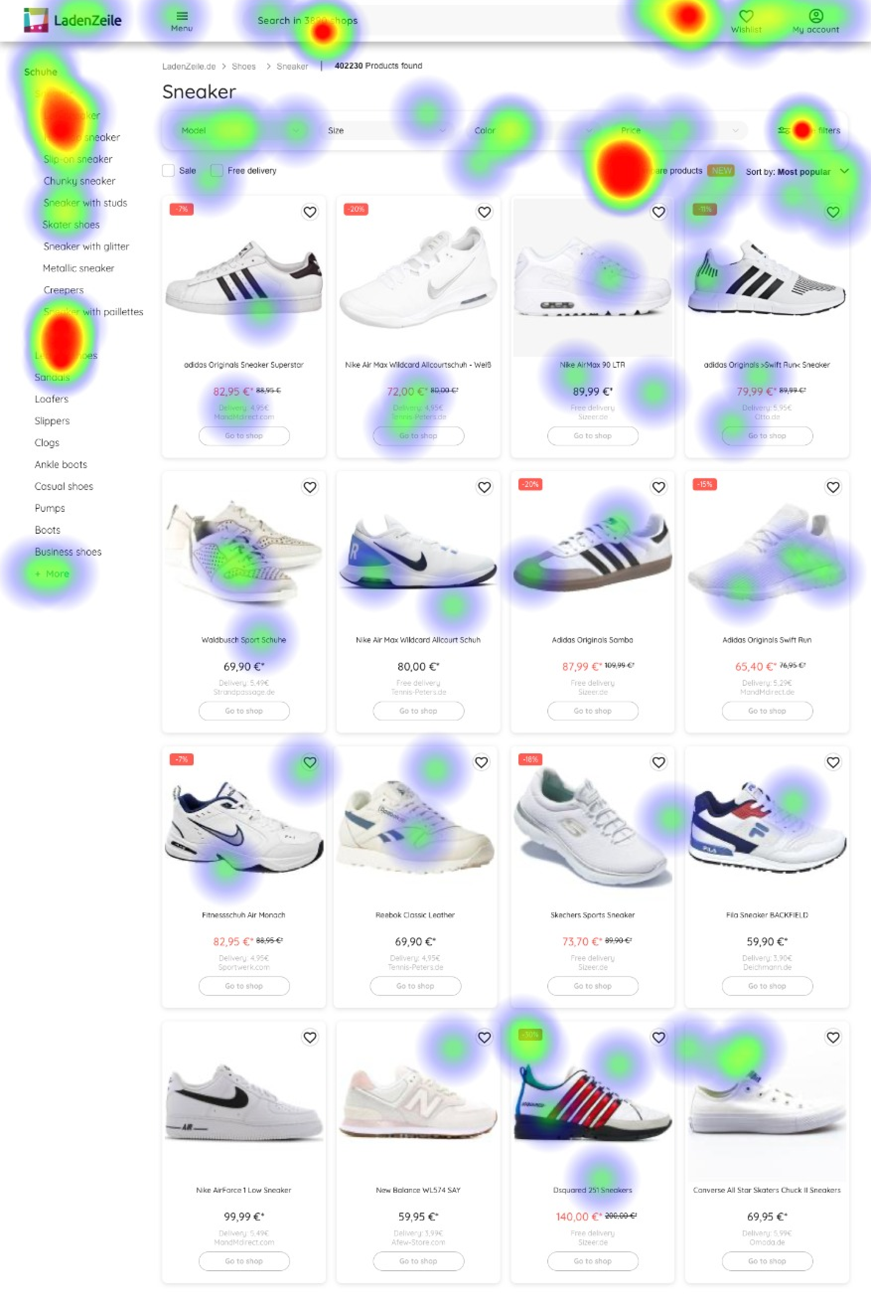
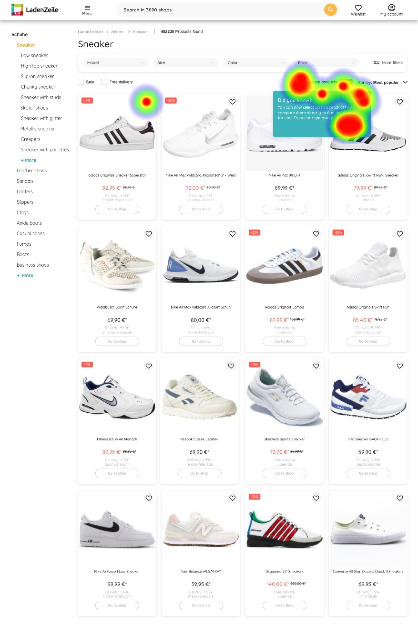
All 3 versions were tested with and without a tooltip to educate users about the new functionality.
Version B: Floating button (winner)
Version C: Icon/button on card
All 3 versions were tested with and without a tooltip to educate users about the new functionality.
"The pop up was very helpful in telling me directly where to click for that feature. This made it very easy to find and do."
"Yes, it helps because it explains clearly an option that I could have missed if I were in a rush."
"Yes, it helps because it explains clearly an option that I could have missed if I were in a rush."
A heatmap interestingly shows the obvious, that a tooltip can be super powerful for drawing the attention of the user to the right area of the product.
Moving forward, I included my learnings from both the user test in person and the unmoderated test for a new round of AB testing onsite.
Now that we added tooltips to walk the user through the functionality, by that made the entry point more noticeable, and placed the button to select items at a spot where users would rather expect it, it must perform better!
Now that we added tooltips to walk the user through the functionality, by that made the entry point more noticeable, and placed the button to select items at a spot where users would rather expect it, it must perform better!
Get ready for testing onsite
After these rounds of testing, the feature was considered unsuccessful for the current state of our product and therefore was deprioritised.
- Our pages are too uncurated, the range of products is too wide (product types, shops, quality levels, price ranges)
- Users would narrow down their search first before even considering comparing specific products
- You already compare subconsciously simply by browsing through the results
Unfortunately, also the second AB test showed only very low engagement with the feature.
Reason enough to run another user test — this time with the actual MVP instead of a prototype. In this round, I asked participants to look for a product they either want to buy or have recently bought to keep the scenario as close as possible to an actual use case.
Key learnings were:
Reason enough to run another user test — this time with the actual MVP instead of a prototype. In this round, I asked participants to look for a product they either want to buy or have recently bought to keep the scenario as close as possible to an actual use case.
Key learnings were:
The final outcome
Personal learnings
WE AREN'T THERE YET
The main learning for me was that we weren't there yet curation and inventory-wise. And assuming we are, the question would be if a feature like the one we had in mind would be relevant for users looking for fashion products. Or if it's a different solution. Or if it's even needed. And how it would vary depending on the product category.
Grow gradually
We tested the feature on the entire platform, which means we had lots of impressions for categories where product comparison of this kind might not even be relevant. I believe the results could have been different if we had focused on one category first, tested here and, if positive, applied our learnings gradually to other categories.
Quality over quantity
Technically, we wanted 3 features in 1: selecting & comparing, product recommendations and saving a selection for later, ideally incl. creating an account. I think the results of our tests were too wide and we should have focused on the core functionality first to A) get more precise results, and B) not be distracted from our initial goal.
Work examples
A parent's journey
GotPhoto ‒ Holistic research as a basis for better understanding the business and the user's journey.
An app from scratch
VELA ‒ The design process from A to Z, from briefing to a fully designed product.